An important part of film production is a name. This allows people to recognise your company from others, and hopefully sets the company apart. The name of our company went through many different phases, from American sounding ones, such as Westroad Productions, ambiguous ones such as Tailor Film, and downright ridiculous ones, such as Imagico Film Productions.
After a few hours of arguing, and a trip to The Ward Arms, we decided to leave the name of the film company for a while, we decided to leave the name of the company to whoever made the logo, and thus, our film company was namedReelhaus Productions.
This name was chosen because it harks back to the German Expressionism movement from Weimar Germany in the 1920's, and because... it sounds good. Bit of German really adds a kick to the name, yes?
All film companies have a distinct logo, which is designed to embody the values that the company holds. That and...
Well, you need a logo, don't you?
We began the planning of our company logo by first looking at some existing ones.
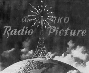

Looking at these, we deduced that film companies tend to use a form of symbolism with their logos for a number of reasons, be they for nature of film, values of the company, or just because it looks good. From this, four distinct logos were made.
Our first logo was made to be eye catching and practical:

Our second logo was made to hark back to Indie amateur film companies from the 1980's:

Our third logo was made to be eye catching, imposing, and drew influences from propaganda from Fascist Italy.

Our fourth and final logo was created to have a warm, social and modernist style to it.

We then put these logos up on SurveyMonkey, and asked people from sixth-form for their receptions of each, and used this to decide a final logo.
No comments:
Post a Comment